MS WORD
MS WORD PART ONE
HOW TO CHANGE CASE OF TEXT ? LOWER CASE,UPPER CASE, TOGGLE CASE, CAPITAL EACH WORD , SENTENCE CASE
HOW TO SAVE MS WORD DOCUMENT ? SAVE AS ,SAVE
HOhttps://youtu.be/VlVgP901018W TO ADD / INSERT COVER PAGE IN WORD DOCUMENT? MS WORD – INSERT TAB- PAGES – COVER PAGE – TYPES
-
Decimal Fraction standard five scholarship online Test
Decimal Fraction standard five scholarship online Test
-
महाराष्ट्र शिक्षक पात्रता परिक्षा 2025 अर्ज करण्यासाठी मुदतवाढ!!
MAHA TET2025 DATE EXTENDED..
-
Profit -Loss : Standard Five Mathematics Scholarship Examination Online Test
नफा तोटा ऑनलाईन टेस्ट profit loss online test
-
Scholarship Math Online Test Standard Five : Multiples and Factors
संख्या विभाजक, विभाज्यतेच्या कसोट्या..
Education World
Proudly powered by WordPress
MS WORD BASIC COURSE
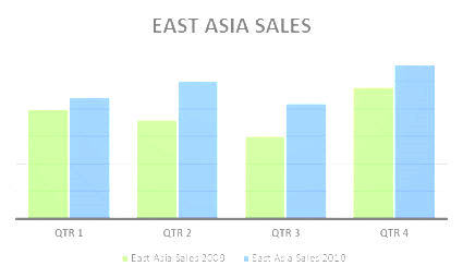
Data that’s arranged in columns or rows on a worksheet can be plotted in a column chart. A column chart typically displays categories along the horizontal (category) axis and values along the vertical (value) axis, as shown in this chart:

Types of column charts
- Clustered column and 3-D clustered column

A clustered column chart shows values in 2-D columns. A 3-D clustered column chart shows columns in 3-D format, but it doesn’t use a third value axis (depth axis). Use this chart when you have categories that represent:
- Ranges of values (for example, item counts).
- Specific scale arrangements (for example, a Likert scale with entries like Strongly agree, Agree, Neutral, Disagree, Strongly disagree).
- Names that are not in any specific order (for example, item names, geographic names, or the names of people).
- Stacked column and 3-D stacked column A stacked column chart shows values in 2-D stacked columns. A 3-D stacked column chart shows the stacked columns in 3-D format, but it doesn’t use a depth axis. Use this chart when you have multiple data series and you want to emphasize the total.

- 100% stacked column and 3-D 100% stacked column A 100% stacked column chart shows values in 2-D columns that are stacked to represent 100%. A 3-D 100% stacked column chart shows the columns in 3-D format, but it doesn’t use a depth axis. Use this chart when you have two or more data series and you want to emphasize the contributions to the whole, especially if the total is the same for each category.

- 3-D column 3-D column charts use three axes that you can change (a horizontal axis, a vertical axis, and a depth axis), and they compare data points along the horizontal and the depth axes. Use this chart when you want to compare data across both categories and data series.


